Understanding the Differences Between Pixels (px) and Rem Units
Choosing the right CSS units is crucial for creating flexible and scalable designs when designing websites and managing styles. Pixels (px) and rem units are among the most popular CSS units, but they serve different purposes and come with their own advantages and disadvantages.
What are Pixels (px)?
Pixels (px) are a fixed-length unit commonly used in screen-based media. They represent the smallest unit of a digital image and are an absolute measure, meaning their size is constant regardless of the size of the parent element or the screen resolution. This makes pixels easy to work with but less adaptable to different screen sizes and user preferences.
What are Rem Units?
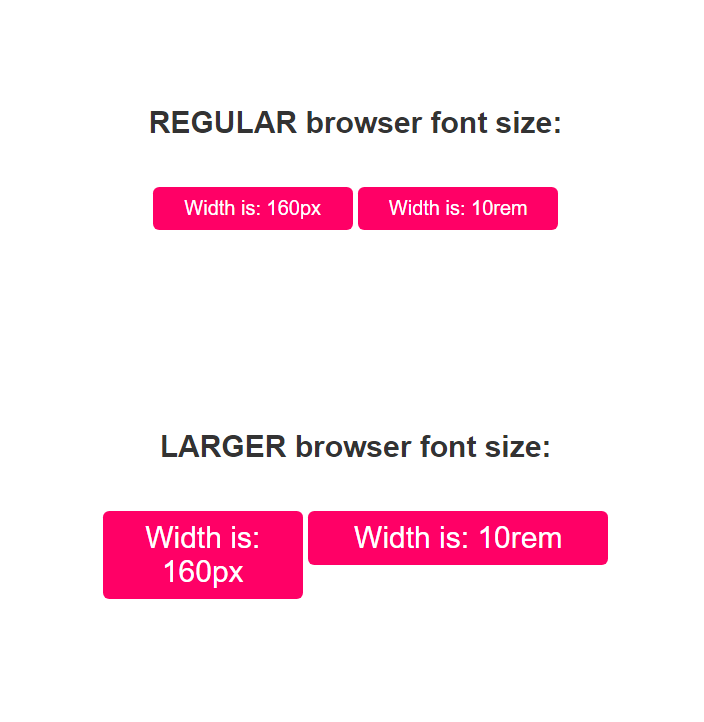
Rem units, short for "root em," are relative units based on the root element's font size (typically the <html> element). Unlike pixels, rem units scale with the user's font size preferences and the base font size of the browser, making them more flexible and accessible for different devices and user needs.
Why Use Rem Units Over Pixels?
There are several reasons to choose rem units over pixels when designing and developing a website:
- Responsiveness: Rem units scale with the base font size, making your design more adaptable to different screen sizes and resolutions.
- Accessibility: Rem units respect user preferences for font size, ensuring a better experience for users with visual impairments or specific font size requirements.
- Scalability: By using rem units, you can easily adjust the base font size for the entire website, making it easier to maintain and scale your design.
For example, imagine a button with a fixed width of 100px. On a high-resolution screen or for a user with a larger font size preference, the button may appear too small and difficult to interact with. By using rem units instead, the button's width can be set relative to the base font size, ensuring it scales appropriately and maintains a consistent appearance across various devices and user preferences.
Conclusion
While pixels remain a popular choice for precise control over layout and design, rem units offer increased flexibility, accessibility, and responsiveness. By using rem units in your CSS, you can create a more user-friendly and adaptable website that caters to a wider range of devices and user preferences.